As a UX Designer does it matter if you create custom styled form widgets for your web sites/apps? What are the risks and implications of creating these?
We’ve now reached a point where the online user experience has become a key differentiating factor between very similar online products and services, in a very saturated marketplace. With each new product attempting to outshine its competitors, many UX/UI Designers are resorting to creating interactive widgets that go beyond the usual HTML form controls.
Custom widgets like date pickers, auto-complete option/selection boxes, tree widgets, toggle switches, can be powerful in helping users navigate complex data sets and complete multi-stepped tasks. However when they get built, developers end up writing these components from scratch because they look inherently different. If the underlying semantics in the mark-up aren’t correctly applied, the content can immediately become inaccessible, to those using assistive technology (AT).
A simple example: the funky drop-down
Lets say you have a funky looking drop-down, but it’s built with mark-up that has no semantic value i.e. a bunch of divs and spans just to make it match the design; no screen reader will know that it is a drop-down like component and won’t announce it as one, or that the user even has the ability to make a selection.
I’m not suggesting to avoid creating new interactive widgets, however I do recommend that in instances where it is possible, reuse any native HTML widgets – and leverage the power of CSS and then JavaScript to achieve your goal. So if your funky new widget smells and behaves like a drop-down, it’s probably best the underlying widget is a drop down – this way when it’s being built the developer doesn’t have to spend lots of time having to build detailed controls that expose the current states and properties to assistive technologies like screen readers. In a nutshell, if you can use a native widget but don’t, you’re simple redoing a lot of work you already could have for free – not to mention adding a lot of mark-up and script overhead to your page, reducing performance.
The following example, shows a heavily styled drop-down that doesn’t look like its native variant, but is only utilising CSS to alter the look and feel whilst still keeping the underlying semantics the same.
See the Pen Funky yet accessible drop down by uxeng (@uxeng) on CodePen.
You may have also noticed if you accessed the code example provided with a screen reader, the user never has the ability to focus on the span element containing the down chevron; I’ve purposely placed aria-hidden=”true” on this element, as it’s purely decorative.
It’s these touches which create better accessible user experiences, as it allows the user to focus on important content without other clutter.
A strategy for building custom widgets
Building custom widget components, even something as seemingly simple as a modal dialog box with a couple of Yes / No buttons, requires a fair amount of thought to ensure they are accessible and navigable in a sound and logical way within the browser by a screen reader.
This short checklist, should help you build components that are robust and carefully consider user accessibility,
1 – Logical flow
Are the sub-components of the widget ordered in a logical semantic manner? Keep items organised in a logical manner, so that they inherently make sense if read in a linearised format.
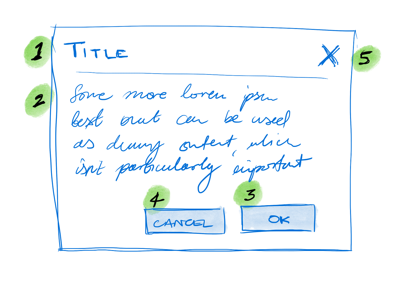
In the dialog box example, the DOM order should be as follows: 1 – Dialog Title, 2 – Content, 3 – OK button, 4 – Cancel button, 5 – Close dialog button. Even though the close dialog button is at the top of the dialog, it logically should be the last element in the dialog box – this is especially pertinent for screen reader users.
2 – Manage keyboard focus and access
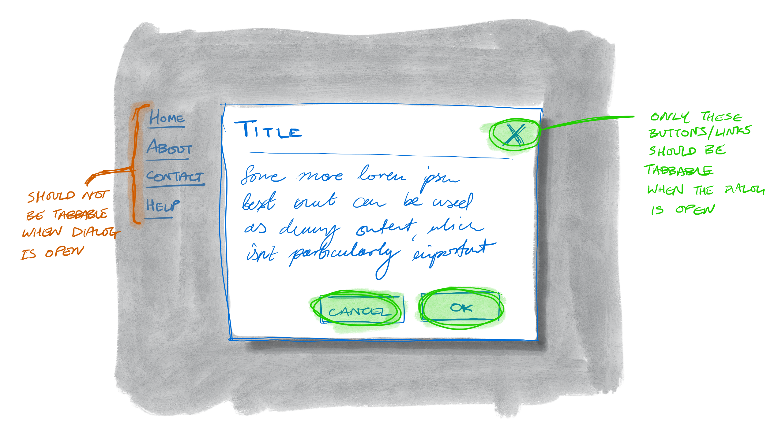
Ensure interactive component elements if needed are tabbable (and there aren’t any keyboard traps). Carrying on with the dialog example – when the dialog is overlayed onto the page – content behind the dialog should not be able to receive keyboard focus. Screen readers should not be able to navigate to this now obscured/hidden content either.
In this instance to achieve this effect, when the dialog appears three actions will need to be undertaken.
- Focus is programatically shifted from the invoking element (the button pressed to raise the dialog) to the dialog’s container element – this container should have tabindex=”-1″ to allow this.
- All the focusable elements outside of the dialog need to have a tabindex=”-1″ set, so that they can no longer receive focus.
- All content outside of the dialog should be marked as aria-hidden=”true”, this is simply achieved by placing this attribute on a container which wraps the remaining page content (obviously not one which includes the open dialog box).Simply reverse these steps when closing the dialog.
The dialog example didn’t have to capture keypresses, so had a relatively simple script – for example if you’re building a tab control, you’ll need to make sure that you utilise JavaScript to allow “left/right” cursors keys to switch along tabs, this is similar to the default behaviour between radio buttons in a single group.
3 – Maintain widget state information with WAI-ARIA
The WAI-ARIA spec outlines a raft of widget roles like progress bars, sliders, and trees; which is great because it means you can build complex widgets and ensure they are accessible. However, widgets like progress bars need to be updated by JavaScript – and the associated aria-attributes also need to be updated accordingly to highlight changes back to the assistive technology. It’s not particularly complicated all you’re doing is adding the correct context and semantics to the arbitrary elements, so they’re exposed to the accessibility API.
4 – Remove unnecessary elements for assistive technology users
As we discussed earlier with the funky drop-down example, elements that are there for decoration (those stray divs and spans used to anchor sneaky before and after pseduo selectors), but serve no semantic or functional purpose should be removed from being picked up by assistive technology. This can be done by simply adding aria-hidden=”true” to the offending elements. This simply reduces confusion and ambiguity around non-standard widgets when a user is utilising assistive technology.
But I use a widget framework…
It’s easy to assume that if you’re using a popular framework like Bootstrap 3, which is loaded with custom widgetry, all of this is taken care of; in some instances the widgets they have built are constructed with accessibility in mind, in others a little less so. Other frameworks like Zurb’s Foundation 6, claim to be built from the ground up to be accessible – i’ve been tinkering with Foundation 6 and found that they do generally follow good semantic markup practices and have infused accessibility from the outset, but a quick play with a screen reader on the Foundation 6: kitchen sink page (where they have all their widgets present) unfortunately led me to find a few clunkers.
So the takeaway here is that even the widely used open source web frameworks aren’t a silver bullet, and need some further finessing to make the accessible experience as good as it needs to be.
But this isn’t my problem…
If you’re a UXer, you may be thinking this is all too technical for me, which is why it’s imperative that UXers work closely with the development team from the outset; and also start becoming more comfortable with understanding code and the technical aspects of the product they’re designing. After all we’re architecting digital products, and we should know the materials we’re using alongside it’s limitations and capabilities.